Key Takeaways
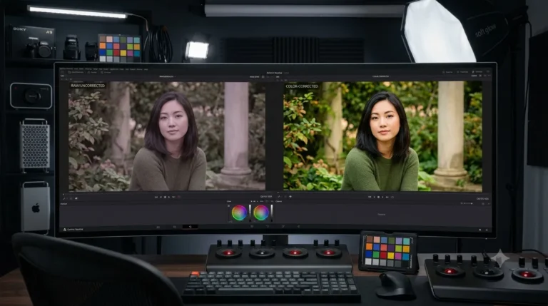
- Grading is creative (mood). Correction is technical (accuracy). Correct first, then grade.
- Shoot RAW and set white balance first. RAW gives you the room grading needs.
- Lightroom’s tone curve, HSL, and colour panels are the easiest place to start.
- Presets are a fast start, but treat them as a base to adjust, not a one click finish.
What Grading Actually Is
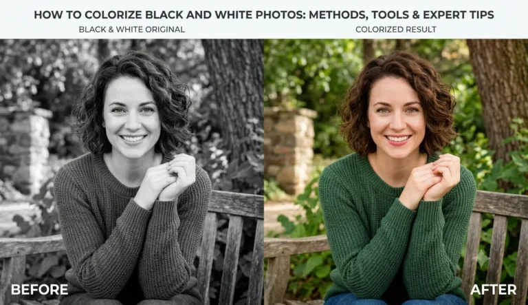
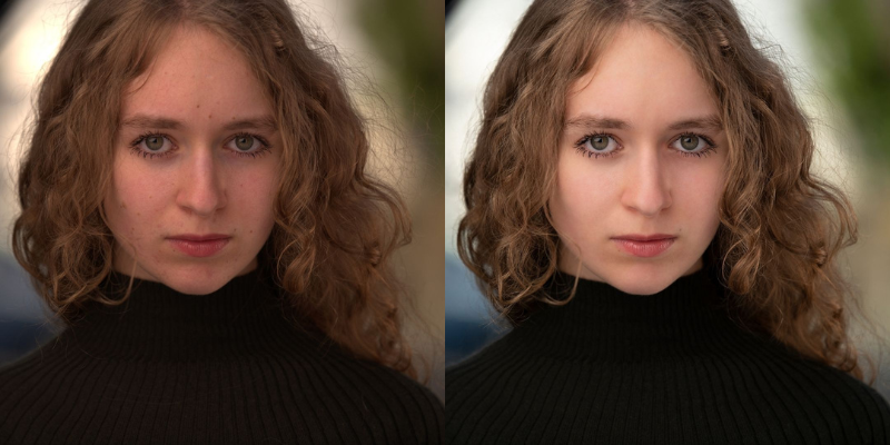
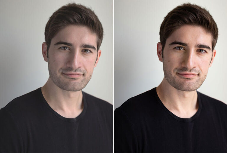
Grading adjusts colour, saturation, and contrast to build a specific atmosphere. Cooler tones (blues) read calm or modern. Warmer tones (yellows, oranges) read warm and nostalgic. It is a stylistic choice, and the same photo graded two ways can feel like two different pictures.Grading vs Correction, and Why Order Matters
Correction comes first: fix exposure, contrast, and white balance so colours read accurately. Grading comes second: push those true colours toward a mood. Grade an uncorrected image and you spend the whole time fighting problems the grade cannot solve, which is why the prep step below matters.Prep the Image
Shoot RAW rather than JPEG. RAW holds far more colour and tonal information, so you can grade without the image falling apart. Set white balance to a neutral, accurate starting point before you begin styling.The Steps
Work through the moves that shape mood: exposure and contrast for the base, the tone curve for depth, vibrance and saturation for intensity (kept subtle), and hue and luminance (HSL) to steer individual colours. Small, deliberate adjustments beat big ones. Over grading is the classic beginner mistake. A quick sanity check: toggle the edit off and on. If the ‘before’ looks broken rather than just flat, you have pushed it too far and should pull the strongest sliders back a touch.Using Presets
Presets, from Lightroom or a marketplace like Etsy, apply a whole grade in one click and are a great way to learn. Install them into Lightroom’s Develop module, apply, then adjust to fit your image. Treat a preset as a starting point, since the same one rarely suits every photo unchanged.
Popular Looks, and How to Get Them
Teal and orange
The cinematic staple: warm skin against cool blue shadows. Push shadows toward teal and highlights toward orange, gently.
Bright and airy
Light, soft, clean. Lift shadows, ease off contrast, keep colours pastel. A wedding and lifestyle favourite.
Moody and dark
Deep shadows, muted colour, added contrast. Drop the shadows and desaturate slightly.
Matte film
A faded, nostalgic feel. Lift the black point on the tone curve so shadows are grey rather than pure black, and mute the saturation.
Doing It in Photoshop Instead
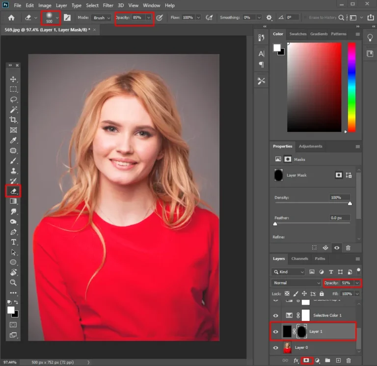
Lightroom is the friendliest start, but Photoshop gives finer, layer based control with Curves, Color Balance, Gradient Maps, and Selective Color. For the full step by step Photoshop method, see our dedicated guide, and consider a professional service when you need one signature look held consistently across a big volume of images, which is hard to keep even by hand.