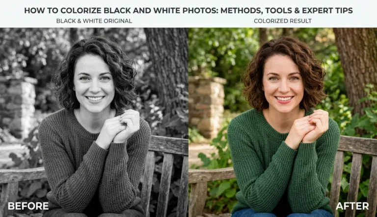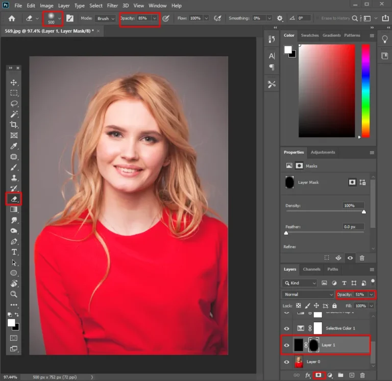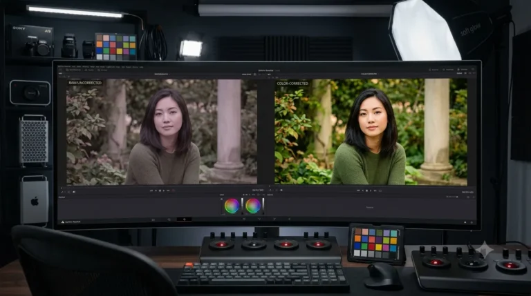
Key Takeaways
- Color balancing produces true colors that make a direct impact on trust; in the case of product pictures, one of the reasons why people return items is a different color.
- In the case of portraits, skin tone is the color that is under the closest examination, as it is noticed first among all other elements.
- Real estate and interior images need correct white balance to avoid perception of unnatural warmth or coolness of the place.
- It is a more specific question compared to the definition of “color correction”.
How Color Balance Correction Improves Photos, by Use Case
Product photography. An inaccurate color cast is one of the most common drivers of e-commerce returns. A shopper receives an item that doesn’t match photo, and it comes back. Marketplaces increasingly expect true-to-life color in listing images, and mismatches erode trust easily, even when the product itself is exactly as described.
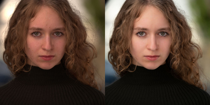
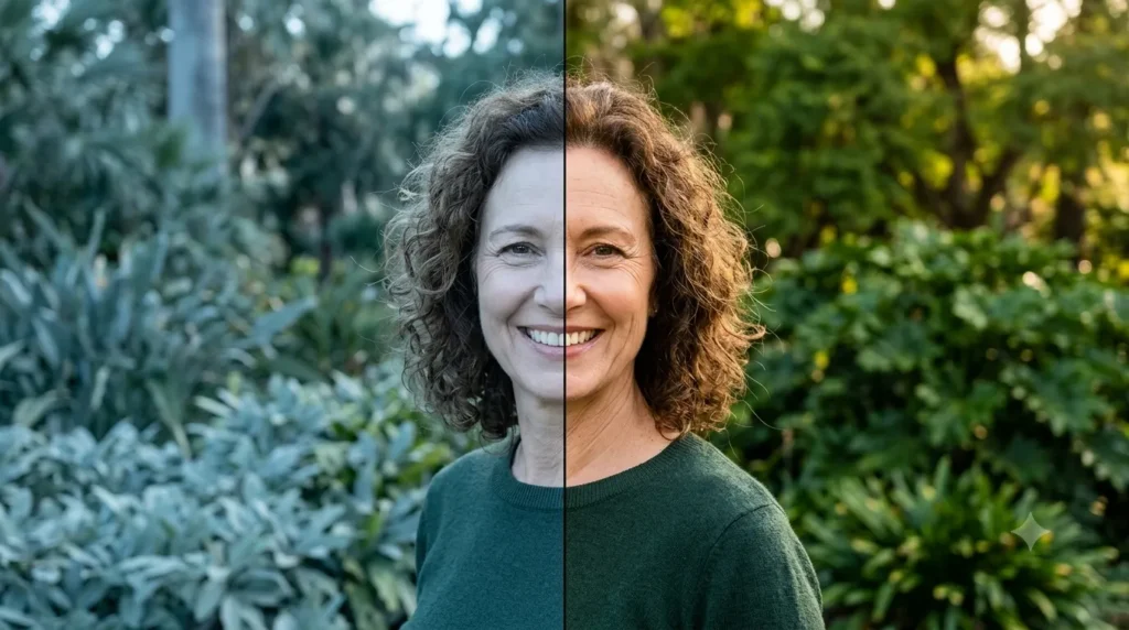
Portrait Photography. Skin tones are the first colors in a photograph that come under close scrutiny, whether the photograph includes people or not. It is quite easy to spot an incorrect color temperature even if the observer can’t tell what makes the color off. Correct color balance is what separates a professionally done photograph from a near-perfect one.
Real Estate Photography. Multiple light sources can have different color temperatures in a shot, such as tungsten, daylight from outside, and fluorescent, which makes it very important to correct white colour balance. Without correct white balance, the photograph can appear unnatural and distorted.
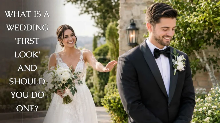
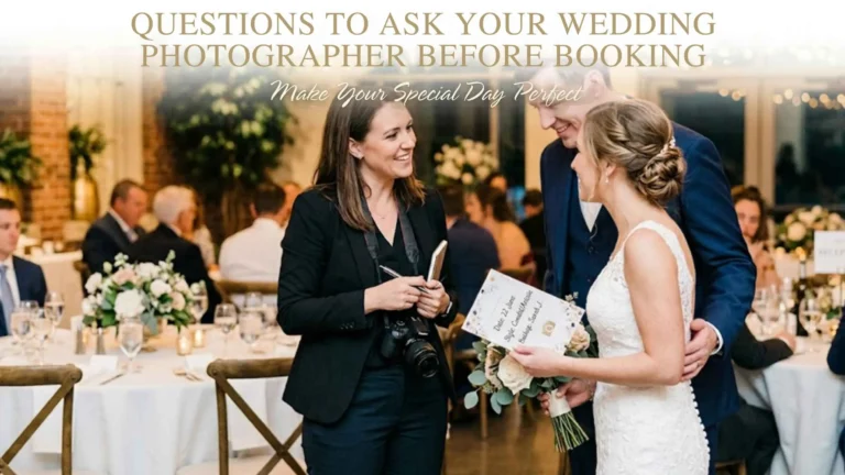
Wedding and event photography. Color consistency across an entire gallery, sometimes shot across an outdoor ceremony, indoor reception, and evening lighting, is what makes a wedding album feel cohesive rather than like three different shoots.
Setting Mood vs. Correcting Color: A Quick Distinction
Color balance correction is about accuracy, not style. If you’re also interested in intentionally shifting color for mood or a cinematic look (as opposed to fixing an unwanted cast), that’s color grading, not correction. See our color grading in Photoshop tutorial for that side of the work.
How to Spot a Color Balance Problem Before You Correct It
The fastest check is to look for a consistent tint across areas of an image that should be neutral: white walls, white shirts, gray pavement. If those areas lean visibly orange, blue, or green all in the same direction, that’s a color balance issue rather than a genuine feature of the scene. A second useful check is to compare the photo to how the scene actually looked in person, or to a reference shot taken in known, neutral lighting. Editors who work with high volumes of images from the same shoot often correct the first image carefully, then use it as a reference point for consistency across the rest of the batch.Why This Matters More for Some Industries Than Others
Color accuracy carries different stakes depending on what’s being photographed. A slightly warm-toned lifestyle photo on a blog is a minor issue. A slightly warm-toned photo of a piece of jewelry, a paint swatch, or a wedding dress is a much bigger problem, because the buyer is making a purchase or memory-keeping decision based specifically on how that color looks. Industries where color fidelity is highest-stakes (jewelry, fashion, interior design, wedding) tend to invest the most in getting this step right before any other editing happens.Frequently Asked Questions
How does color correction improve the appeal of a product photo?
Does correcting color balance improve color payoff in a photo?
Is color balance correction the same as white balance?
How do I improve product photos for my online store?
Start with accurate color balance and consistent lighting across the shoot, then add background removal, replacement, and retouching as needed. See our full e-commerce photo editing guide for the complete picture.