Key Takeaways
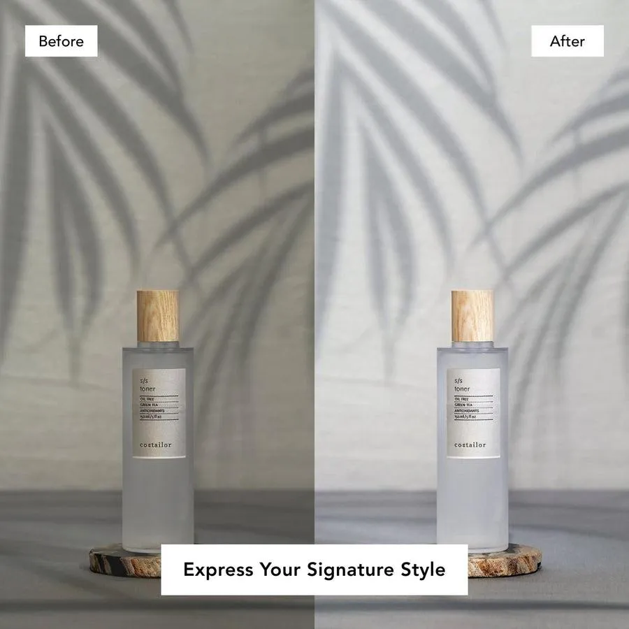
- Shadows add depth and credibility. Without one, even a perfect cutout looks fake.
- Soft shadows suit most products. Hard shadows suit bold fashion and tech, but require precise light.
- Good shadows start with diffused light at around 45 degrees, and the surface matters too.
- In Photoshop, build the shadow on a low-opacity layer under the product, and keep it subtle.
Why the Shadow Does So Much
A shadow tells you three things at once: which way the light falls, how heavy the object is, and that it is actually sitting on a surface. Take it away and a perfectly cut-out product reads as fake. Put it back and the same image gains depth and looks like it belongs in real life, encouraging a shopper to buy.Soft or Hard
Soft shadows. Clean and realistic, they suit most products, cosmetics, food, accessories, and are the safe default for e-commerce.
Hard shadows. Bolder and more graphic. They work for fashion and tech campaigns, but they need precise lighting, or they look off.
The Four Types Worth Knowing
Shadow Drop
A subtle shadow just beneath the product, appearing as if lit by an upward-facing light from the front.Natural/Cast Shadow
The true shadow that the product casts under slanted lighting. Works well if you are looking to capture an editorial, realistic effect.Reflection Shadow
A real image of the product reflected from a plane surface. Looks high-end and therefore works well for technology, cosmetics, and luxury products.Floating Shadow
A shadow separated from the product so that it floats. Works well for footwear and accessories to make a light, floating effect.Start With the Light
Diffused light beats direct light for natural shadows. A softbox, a diffuser, or window light at roughly 45 degrees gives the most believable shadow shape. Get this right in the shot, and you do far less work and get a better result in editing.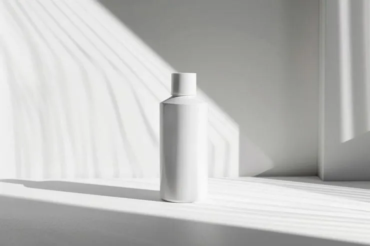
The Surface Counts Too
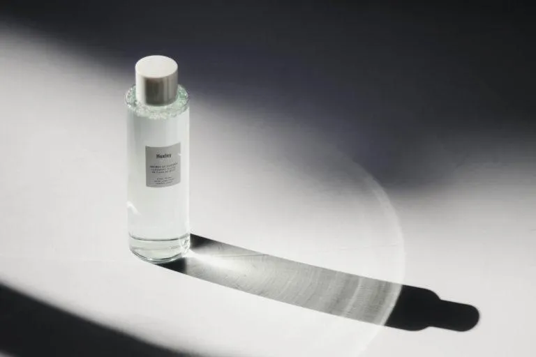
What the product sits on shapes the shadow. Matte surfaces give clean shadows, textured surfaces add warmth, and glossy materials add a subtle reflection that reads as premium, handy for luxury pieces.
Building One in Photoshop
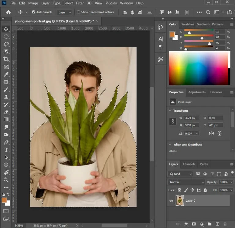
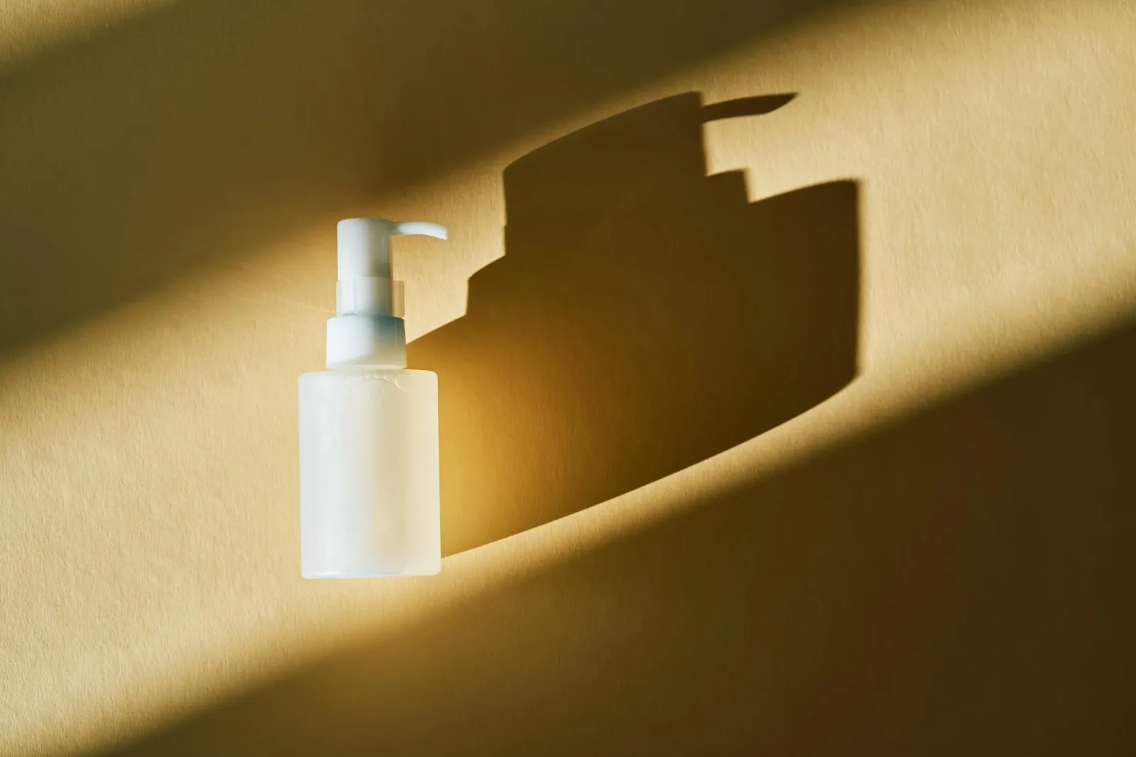
No usable shadow in the shot? Make one. Add a new layer beneath the product, paint a soft, low-opacity shadow, then blur the edges and drop the opacity until it blends. The usual mistake is overdoing it. An overly dark, too sharp, perfectly round shadow reads as fake instantly. Match its direction to the light already in the image.
Where a Pro Earns Their Keep
One shadow is easy. Keeping shadow direction, softness, and intensity identical across a hundred product catalogue images is not. That is where professional ecommerce photo editing pays off: every image matches, so the store reads as a coherent brand instead of a patchwork.