Key Takeaways
- Fix white balance first; most skin-tone problems start with the wrong color temperature.
- Judge skin on a calibrated screen; an uncalibrated monitor lies to you.
- Use targeted tools (HSL, adjustment brushes), so you correct skin without wrecking the rest of the frame.
- Keep it subtle. Oversaturation or warm skin is the most common mistake in portrait editing.
- Build a repeatable palette so a full shoot looks consistent, not patchy.
Color correction photography for portraits comes down to one goal: skin that looks real. When the skin tones are right, the whole photo looks polished. When they’re too orange, too red, or green from fluorescent lighting, even a beautifully framed shot appears amateur. This guide is only about portraits, so we won’t get into general color theory.
Fix the basics first. That means exposure, white balance, and skin tone. Portrait color correction and general photo color correction both start here, and creative grading comes after. Once those look right, you can add a creative mood with color grading. The mistake people make is trying to do both at once.
Start With a Good RAW File
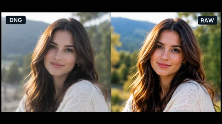
Color correction photo edits can only recover what the file contains. Shoot in RAW, expose for the skin (not the background), and set a custom white balance on set using a grey card when you can. A clean RAW file makes every later step easier and protects skin detail when you push colors.Get White Balance Right First
Before touching anything else, neutralize the color cast. In Lightroom or Camera Raw, use the white-balance eyedropper on a neutral grey area, then fine-tune Temperature and Tint until the skin looks natural, not blue, orange, or magenta. Almost every “bad skin tone” problem is really a white-balance problem.Correct Skin Tones With Targeted Tools
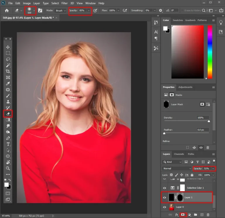
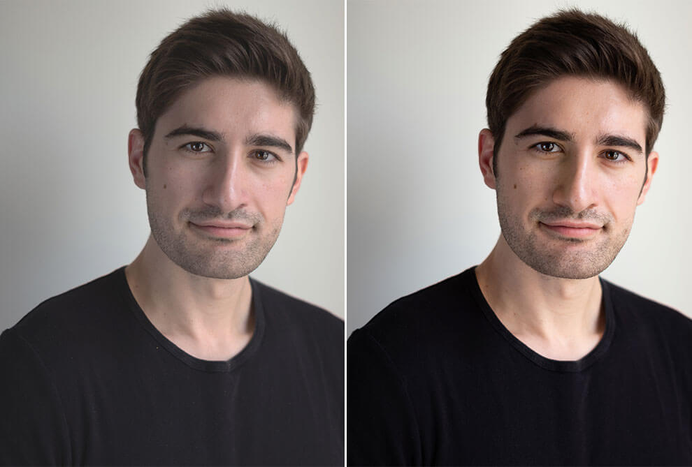
Global sliders change everything in the frame at once, and that’s usually not what a portrait needs. Lightroom is a strong photo editor for portraits because its HSL panel and local tools are built for skin. Open the HSL panel and make small adjustments to the orange and red channels, since that’s where skin tones sit. If the skin looks a little sunburnt, bring the saturation down slightly. Use Luminance to make it lighter or deeper. If only one area needs fixing, like a red patch on a cheek or blotchy color across the face, use an adjustment brush or a radial filter and work on just that spot.Keep Skin Natural, Not Plastic
The goal is to show the person on their best day, not turn them into a mannequin. Don’t push saturation and warmth too far, and keep the natural variation in their skin. A forehead and a cheek are never the same flat color. Photo editing for portraits should stay light when you retouch as well as color correct, because texture is what keeps skin looking real. Our guide to skin retouching in Photoshop covers that balance in detail.
Build a Consistent Palette Across the Shoot
Clients notice when image five looks warmer than image four. If you need to color correct photo batches quickly, correct one strong frame first, then sync those settings across similar shots and adjust individually where the light changed. A consistent palette is what makes a gallery feel like one coherent session.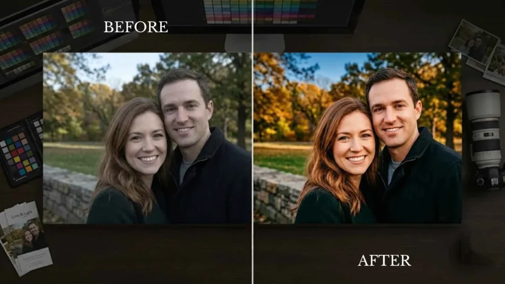
When to Grade and When to Hand It Off
Once skin is accurate, you can add a mood: a soft warm grade for weddings, a clean neutral look for corporate headshots. But grading a large volume of portraits to a consistent standard is slow and demanding on the eye, which is exactly why high-volume photographers outsource it. A professional portrait editor or retouching team keeps skin tones accurate and consistent across an entire shoot so you can stay behind the camera.