Key Takeaways
• Color correction fixes accuracy (white balance, exposure, contrast). Color grading adds style (mood, tone, creative color).
• Color correction should almost always happen before color grading, you fix the technical problems first, then add creative style on a clean base.
• One common Photoshop technique uses white, black, and neutral gray reference points to help identify and correct unwanted color casts.
• For product photography specifically, accurate color correction directly affects return rates, a shopper who receives an item that doesn’t match its photo is a shopper who sends it back.
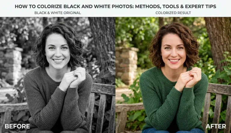
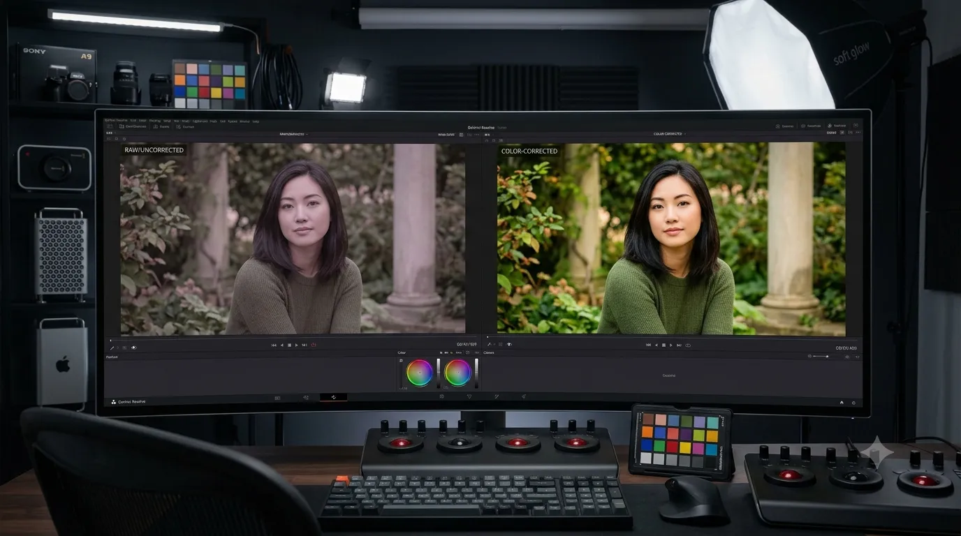
Color correction is the process of adjusting color and tonal imbalance, such as white balance, exposure and contrast to make a photo look natural and technically accurate. It’s a different job from color grading, and the two get confused constantly, so let’s clear that up first, then walk through how to actually do it in Photoshop.
Color Correction vs. Color Grading. What’s the Difference?
Color Correction: Goal is technical accuracy. Fixes white balance, exposure, contrast. Happens first, on a raw or flat image. Example: removing an orange cast from indoor lighting.
Color Grading: Goal is creative mood/style. Adjusts saturation, hue, tone curves. Happens after correction, as a stylistic layer. Example: giving a wedding photo a warm, cinematic look.
If you’re also curious how the creative side works, see our step-by-step guide to color grading in Photoshop.
How to Color Correct a Photo in Photoshop (Gray-Point Method)
This is the practical technical approach, using neutral reference points in the image to help correct unwanted color casts.
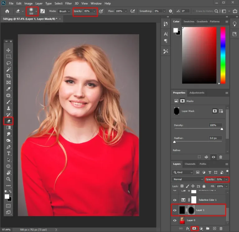
- Open the Info palette. Window → Info. This shows you the RGB values under your cursor as you sample the image.
- Add Color Sampler points. Select the Color Sampler tool (shares a spot with the Eyedropper). Click a few areas that you know should be neutral. Avoid assuming that a white shirt or a black object is automatically color neutral.
- Read the values. A neutral point will generally have relatively similar R, G and B values. Large differences between the channels may indicate a color contrast.
- Add a Curves adjustment layer. Layer → New Adjustment Layer → Curves.
Adjust the Red, Green, and Blue channels as needed to reduce unwanted color casts. Use your sampled reference points as a guide and aim for balanced RGB values in areas that should appear neutral, using roughly 245 for your white point and 15 for your black point as starting reference values.
Review the overall image, fine-tune the adjustment if needed, and export a copy once satisfied with the result.
This is a genuinely technical process, and it takes practice to do quickly, professional colorists build an eye for spotting casts before they even open the Info palette.
Why Color Correction Matters for Product and Portrait Photos
For product photography: accurate color correction helps customers see a product more clearly and can reduce the risk of a mismatch between what shoppers expect and what they receive. For online stores, showing products as accurately as possible can help customers make more informed purchasing decisions.
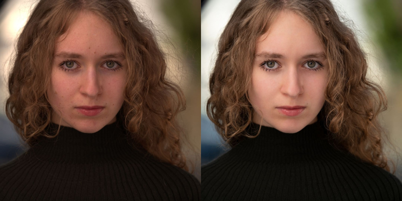
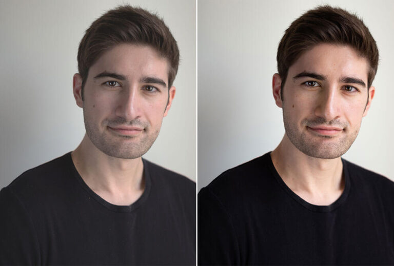
For portraits: Skin tone is one of the most noticeable elements in portrait photography, so even small color shifts can make an image look unnatural. See our tips for color correction in portrait photography for portrait-specific guidance.
Common Color Correction Mistakes to Avoid
Over-correcting warm tones out of a photo entirely. Some warmth is natural, especially in golden-hour or indoor tungsten shots. Stripping all warmth out in the name of “accuracy” often makes a photo look colder and less inviting than the original scene actually felt.
Sampling the wrong reference point. A gray point that isn’t actually neutral (a slightly warm-toned “white” shirt, for example) will pull your whole correction in the wrong direction. Choose reference points you’re confident are genuinely neutral, or use a gray card during the shoot specifically for this purpose.
Correcting on an uncalibrated monitor. If your screen has its own color cast, you’ll compensate for the wrong problem. This matters more for anyone doing this professionally or at volume than for a single personal photo.
Skipping correction because a photo “looks fine.” Color casts are often more visible to a viewer seeing the photo fresh than to the person who’s been staring at it during editing. Checking neutral areas can help reveal subtle color casts that may be harder to notice after looking at the same image for a long time.