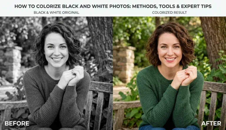
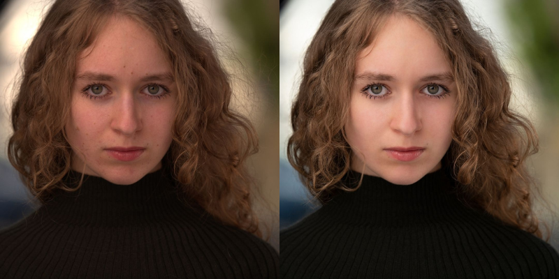
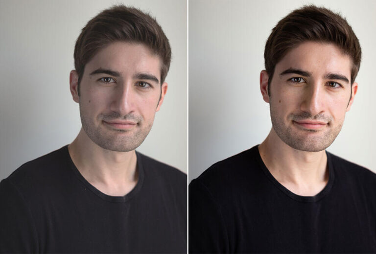
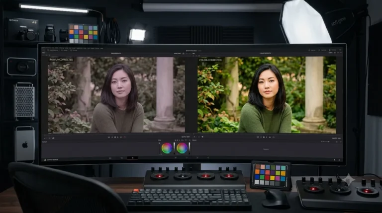
Color grading in Photoshop is the process of adjusting an image’s colors to create a particular mood, style, or visual feel. Correction fixes exposure and white balance so an image looks right. Grading pushes the colours somewhere on purpose: warm and nostalgic, cool and filmic, dark and dramatic. This walkthrough takes you through doing it in Photoshop from a blank start, using only adjustment layers so nothing you do touches the original file.
You do not need to be an expert. Follow the order, keep a light hand, and you will get a clean, professional look.
What is the Difference Between Color Grading and Color Correction?
Correction is the clean up: fix exposure, contrast, and white balance so colours read true. Grading is the styling that comes after, when you nudge those true colours toward a feeling. Warm tones read cosy and nostalgic. Cooler tones with more contrast read modern and moody. Grading almost always starts from a corrected image, which is why the prep step below matters.
Prep the Image First
Get a neutral starting point before you touch the mood: sort out exposure, set white balance, clear any obvious blemishes or distractions, and crop or straighten if it needs it. Skip this and you spend the grade fighting problems the grade cannot actually fix.
How to Do Color Grading in Photoshop
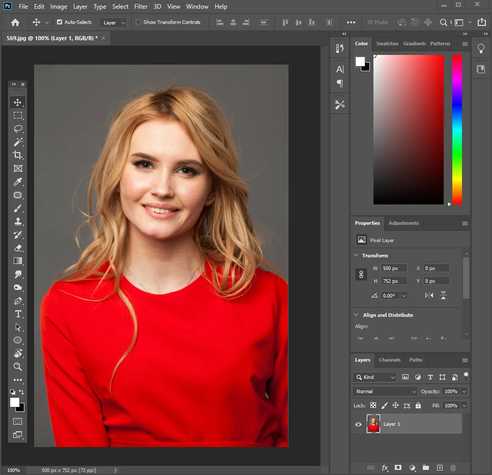
- Open your image. File > Open, and pick a good quality file. Color grading amplifies whatever you feed it.
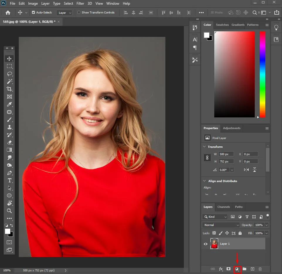
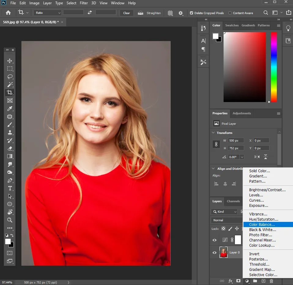
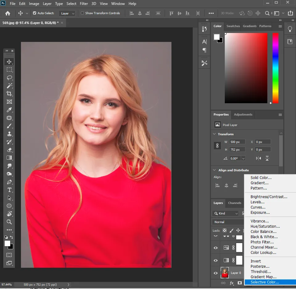
- Add adjustment layers, not direct edits. Click the Adjustment Layer icon at the bottom of the Layers panel. Everything below uses one, so you can dial anything back or delete it without harming the original.
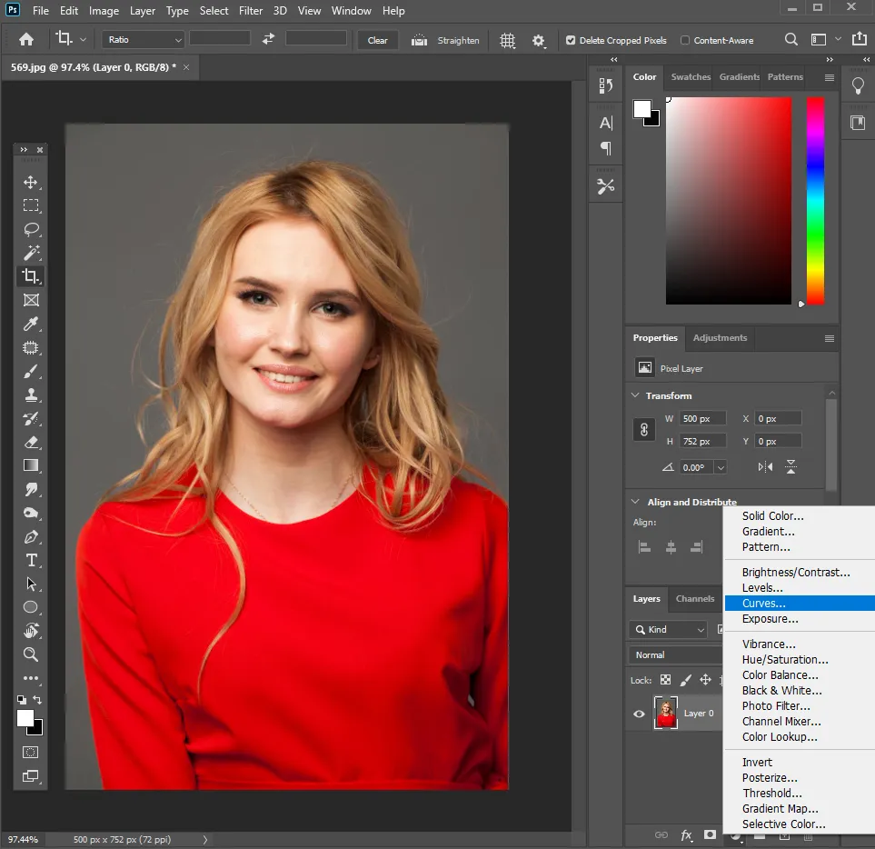
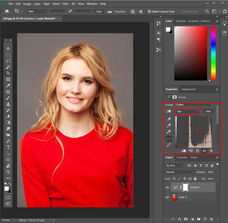
- Set contrast with Curves. Add a Curves layer and make a gentle S shape: pull the shadows down a touch, lift the highlights. For colour adjustments, remember that the RGB channels work with complementary colours. Red can make an image warmer, while Blue can make it cooler, and Green can bring balance.
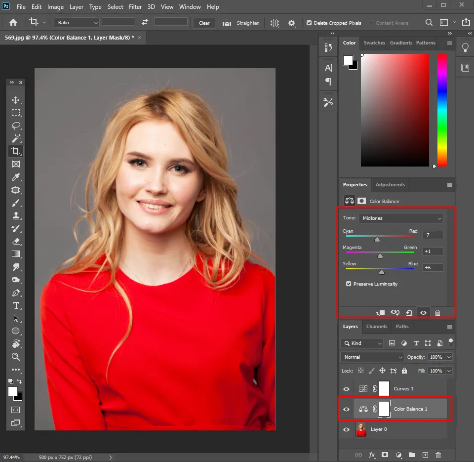
- Add mood with Color Balance. A Color Balance layer lets you steer Shadows, Midtones, and Highlights separately. This is where the tone comes from.
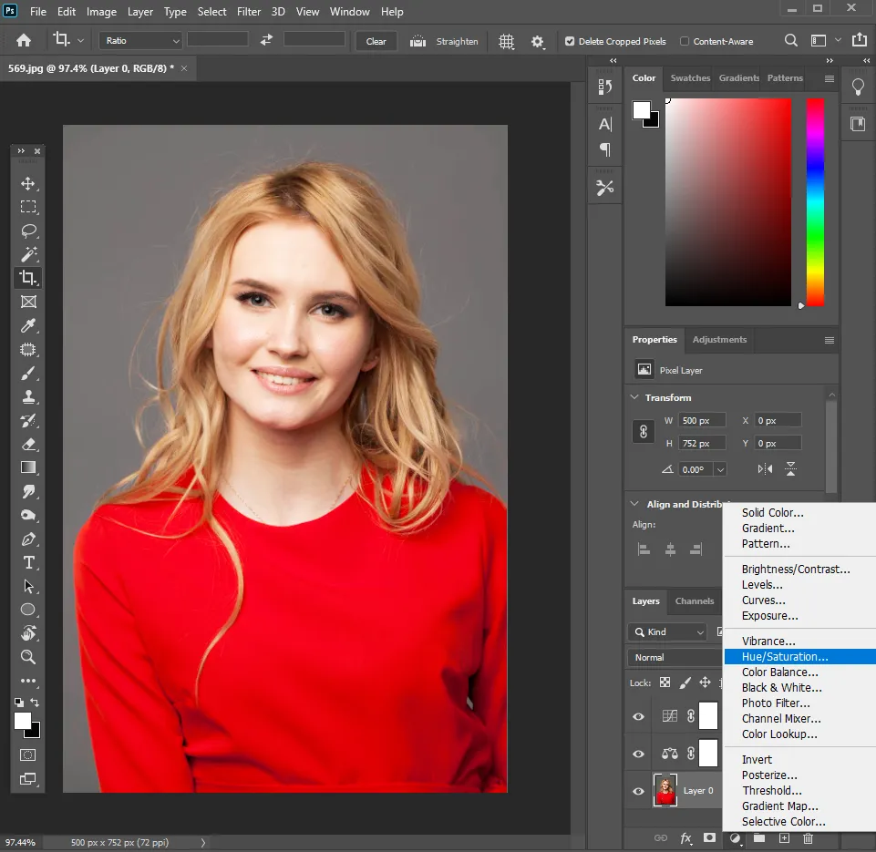
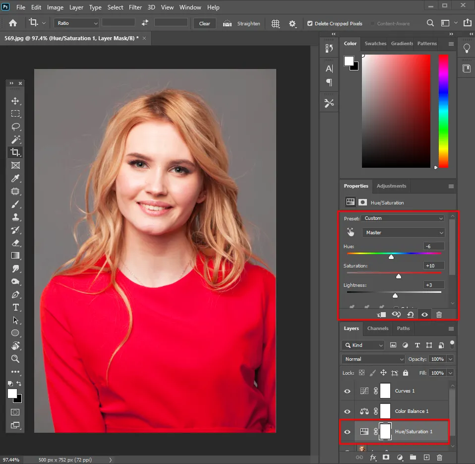
- Refine with Hue/Saturation. Shift specific colours and adjust saturation, but keep it restrained. Over saturation is what makes an edit look fake.
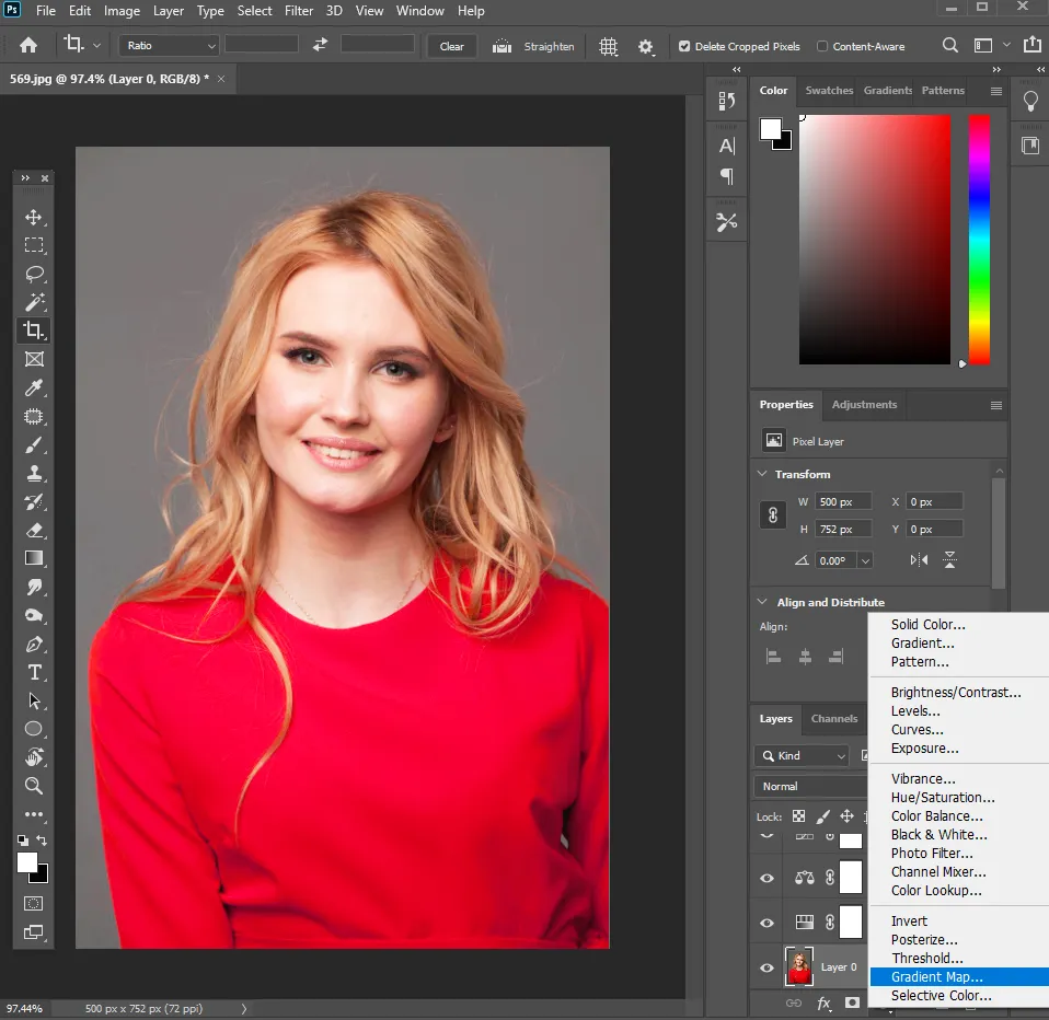
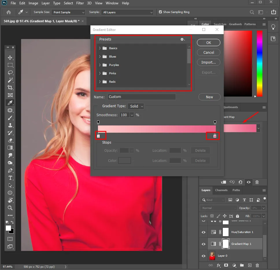
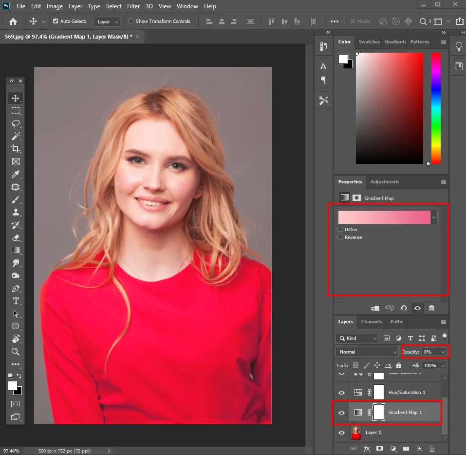
- Try a Gradient Map. Add one, pick or build a gradient, then drop its opacity for a subtle, cinematic tone. Fast route to a polished, film like feel.
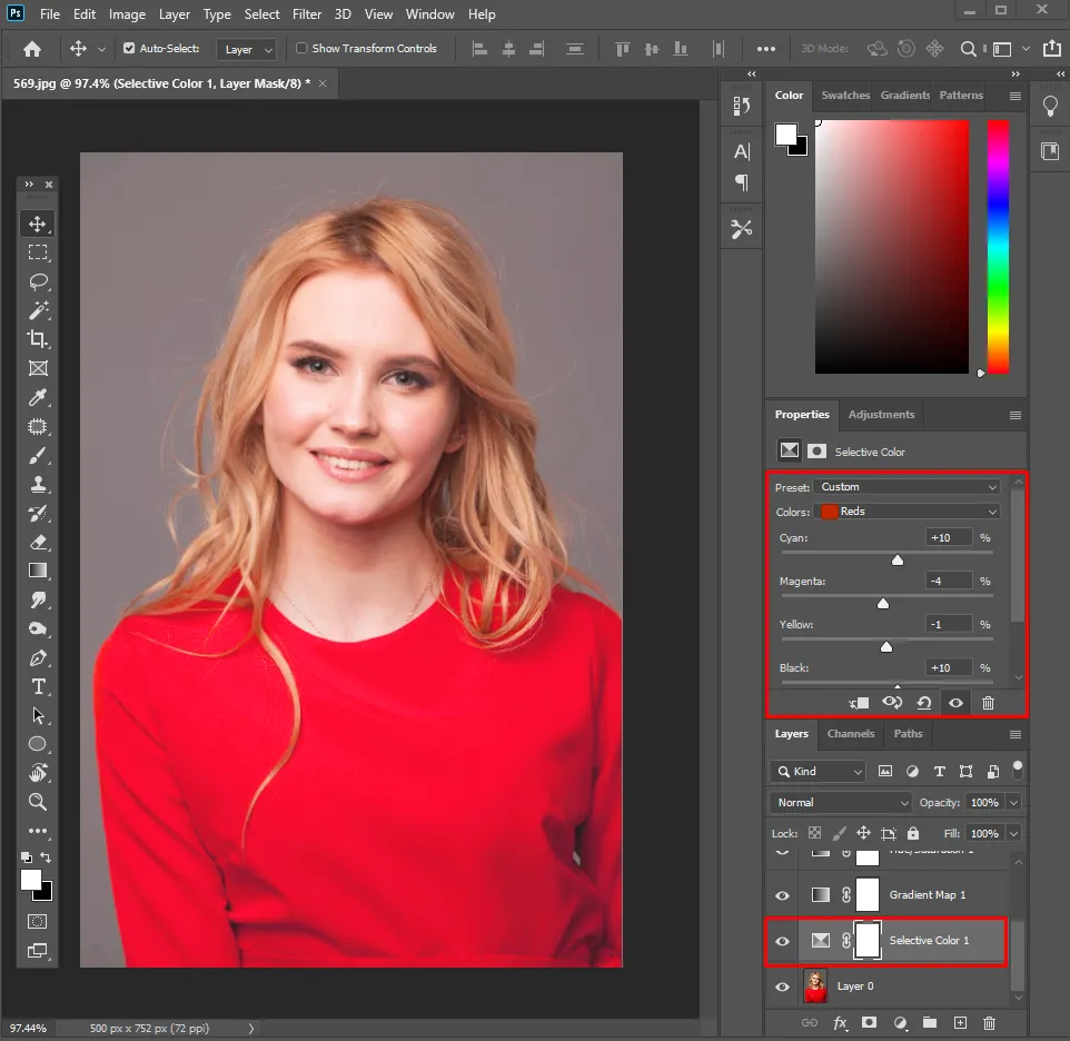
- Fine tune with Selective Color. Adjust one colour family at a time, say cooling only the reds, without touching the rest of the frame.
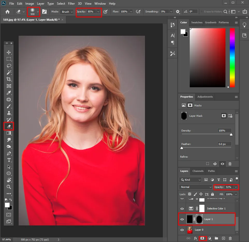
- Add a vignette. Pull the eye to your subject with a soft, low opacity dark vignette, or use Camera Raw Filter > Effects > Vignette.
- Check and export. Toggle your layers on and off to sanity check the effect, then File > Export > Export As and choose your format.